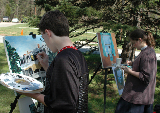
Every child who is taught to read and write will not author a great novel. Every child who is trained to play a musical instrument will not compose a symphony. Every child who is taught to draw will not see his work hanging in the Louvre. However, the reader will have access to great literature; the musician will have an understanding and appreciation for great music; and the one who studied art will be able to discriminate between good and bad art. It is clear in God's word that He loves craftsmanship and design. God's direction to Moses on Mount Sinai was specific (Exodus 25:8-9). God specially appointed Bezalel to be the craftsman for the tabernacle. "See, I have chosen Bezalel...and I have filled him with the Spirit of God, with skill, ability and knowledge in all kinds of crafts, to make artistic designs for work in gold, silver, and bronze, to cut and set stones, to work in wood, and to engage in all kinds of craftsmanship" (Exodus 31:2-5). To put it simply, God created. Consequently, we want to create after Him.
Congressional Art Contest Winners
These Rockbridge Academy art students won first place in the U.S. Congressional Art Contest. The paintings were on display at the U.S. Capitol building in Washington, DC, for an entire year. Congratulations to Haylee Campbell (née Scarborough) '11 and Gabriel Crane ’23.
.jpg)
Haylee Campbell (née Scarborough), Class of 2011
A Homeless Patriot in Washington, D.C., watercolor on paper
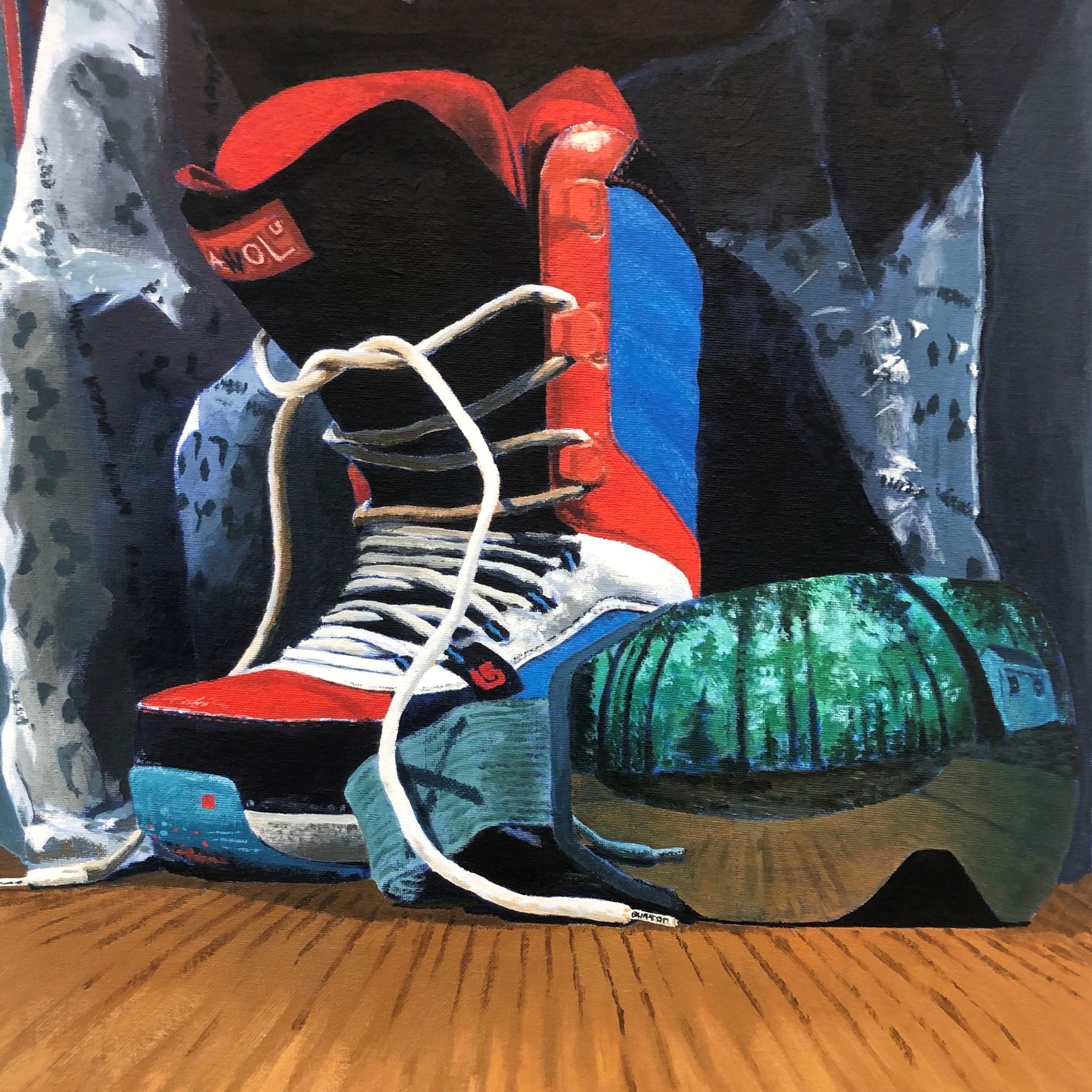
Gabriel Crane, Class of 2023
Waiting for Winter, acrylic on canvas
National ACCS Blakey Prize in Fine Arts Winners
All ACCS (Association of Classical Christian Schools) member schools are invited to submit one student's artwork for the national ACCS Blakey Prize in Fine Arts Competition in both the drawing and painting categories; these submissions are given anonymous labels for judging. Since the very first Blakey Prize in Fine Arts Competition began in 2015, eight Rockbridge students have won either first or second prize in this national competition—more than any other ACCS school in the country. Thanks be to God for our dedicated art teachers who help the students see and create beauty.
Fine art is that in which the hand, the head, and the heart of man go together.
John Ruskin
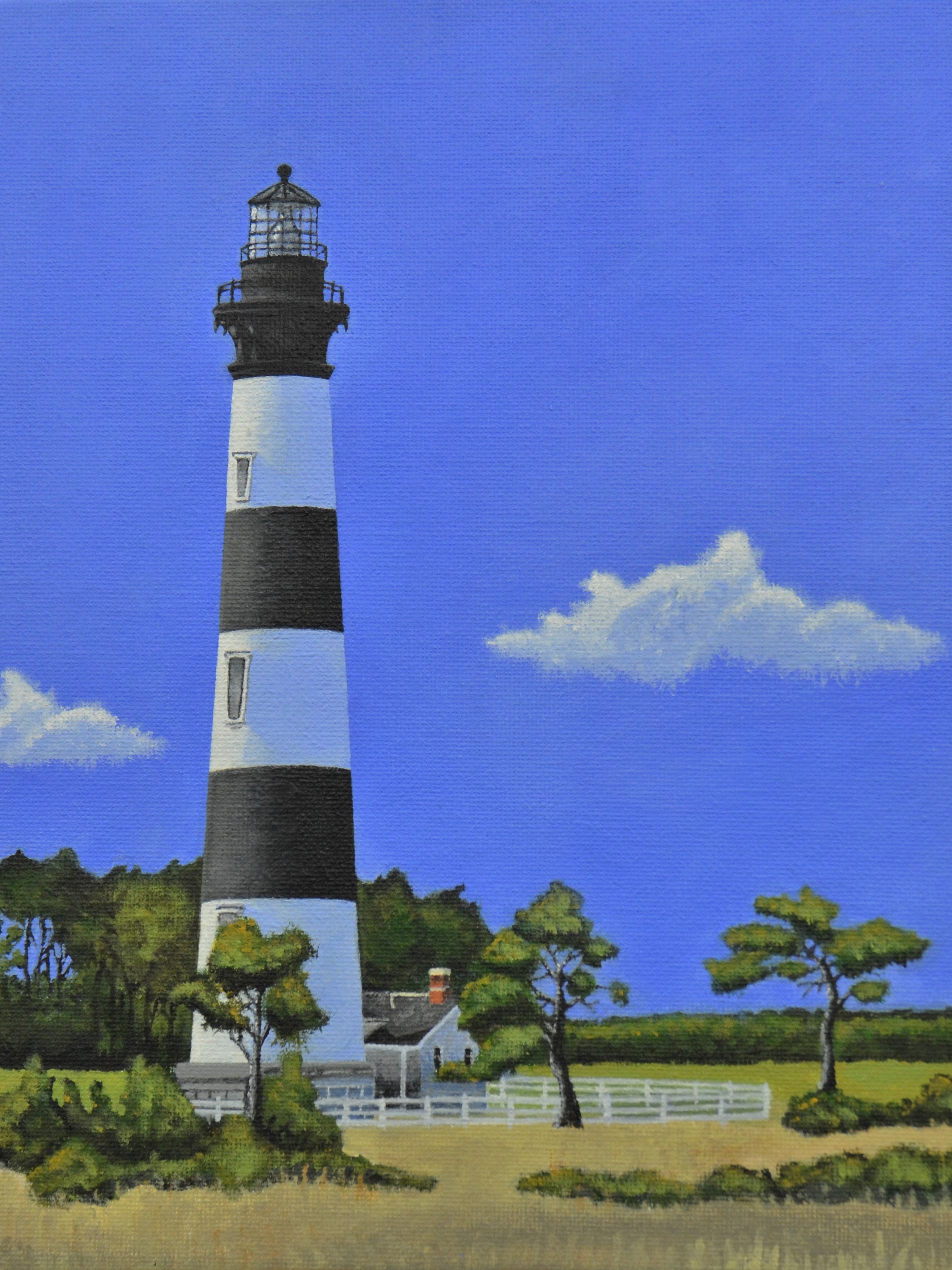
Hannah Bumgarner (12th grade), Anniversary Gift of Bodie Lighthouse, 2nd place in the greeting card division
Her painting will be printed as stationery for the ACCS conference and included in the 2025 ACCS calendar. She shares, "I have enjoyed the lighthouse paintings of Edward Hopper, but my style is different. I was hoping for realism, and I strove to have accuracy and excellence in every part of this painting. It was painstaking and a joy to complete. I took this photograph while visiting Bodie Lighthouse in Cape Hatteras with my sister and my parents. It was their anniversary, and I wanted to paint it as a gift for them.”
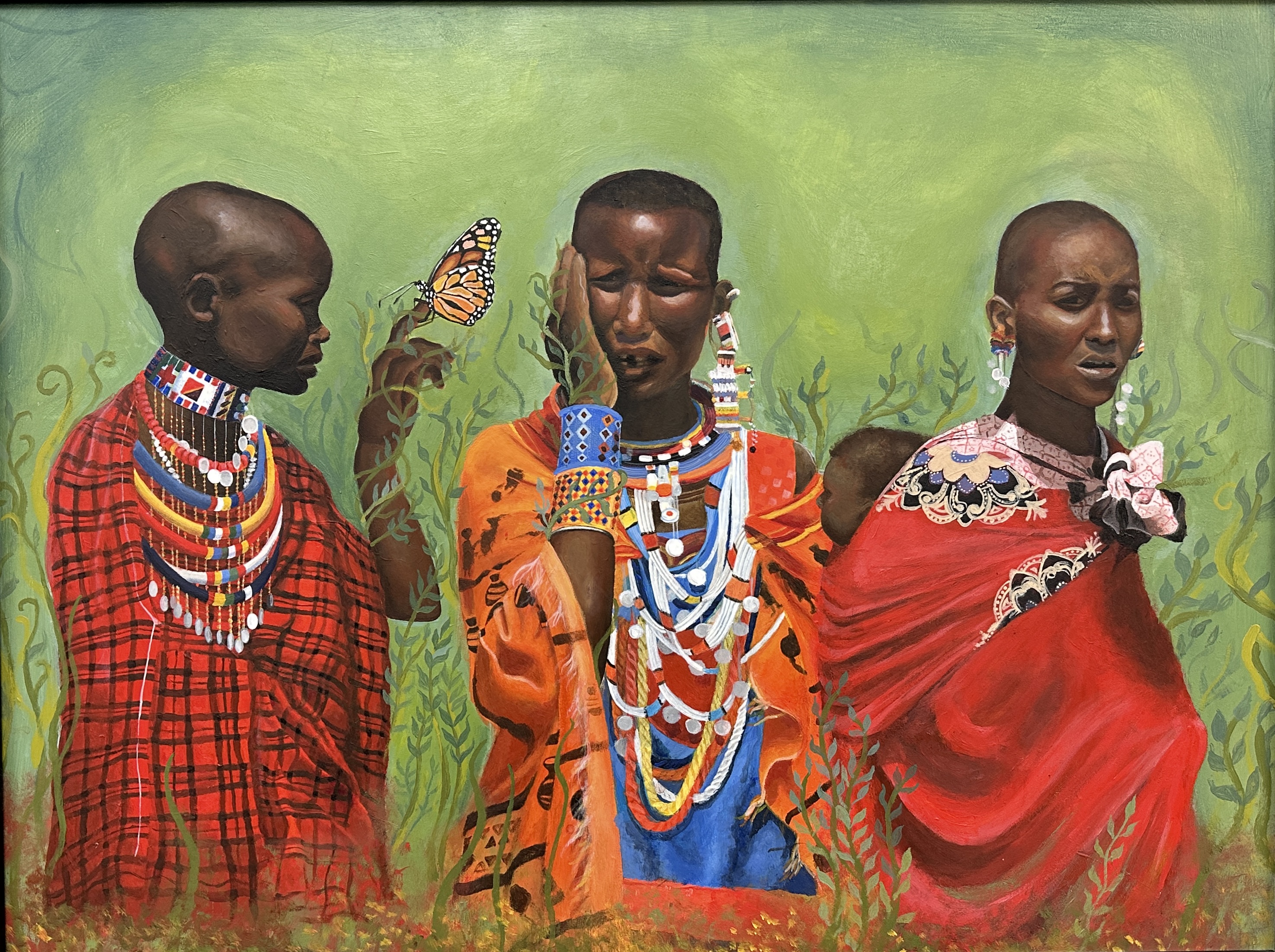
Emma Leeman (11th grade), More Through Less, 2nd prize in painting, 2023, 18" x 24", acrylic on gessoboard
Artist statement: Several years ago, my father, sister, and I visited the Maasai tribe in Kenya, Africa. These people lived far from modern society. I photographed women as they participated in a traditional dance and was struck by the joy I saw as they danced together. It was obvious how little these people had. Despite the scarcity of material goods, their hearts soared as they danced and sang together. “What brings them such joy?” I asked myself. This experience inspired me to paint the women and the beauty that I found within their culture. Although they have little compared to the average modern American, it seemed as if they were rich in that they found happiness in their community, unity, and love for one another. I often assume that material goods will satisfy me, yet these people have truly found more through less.
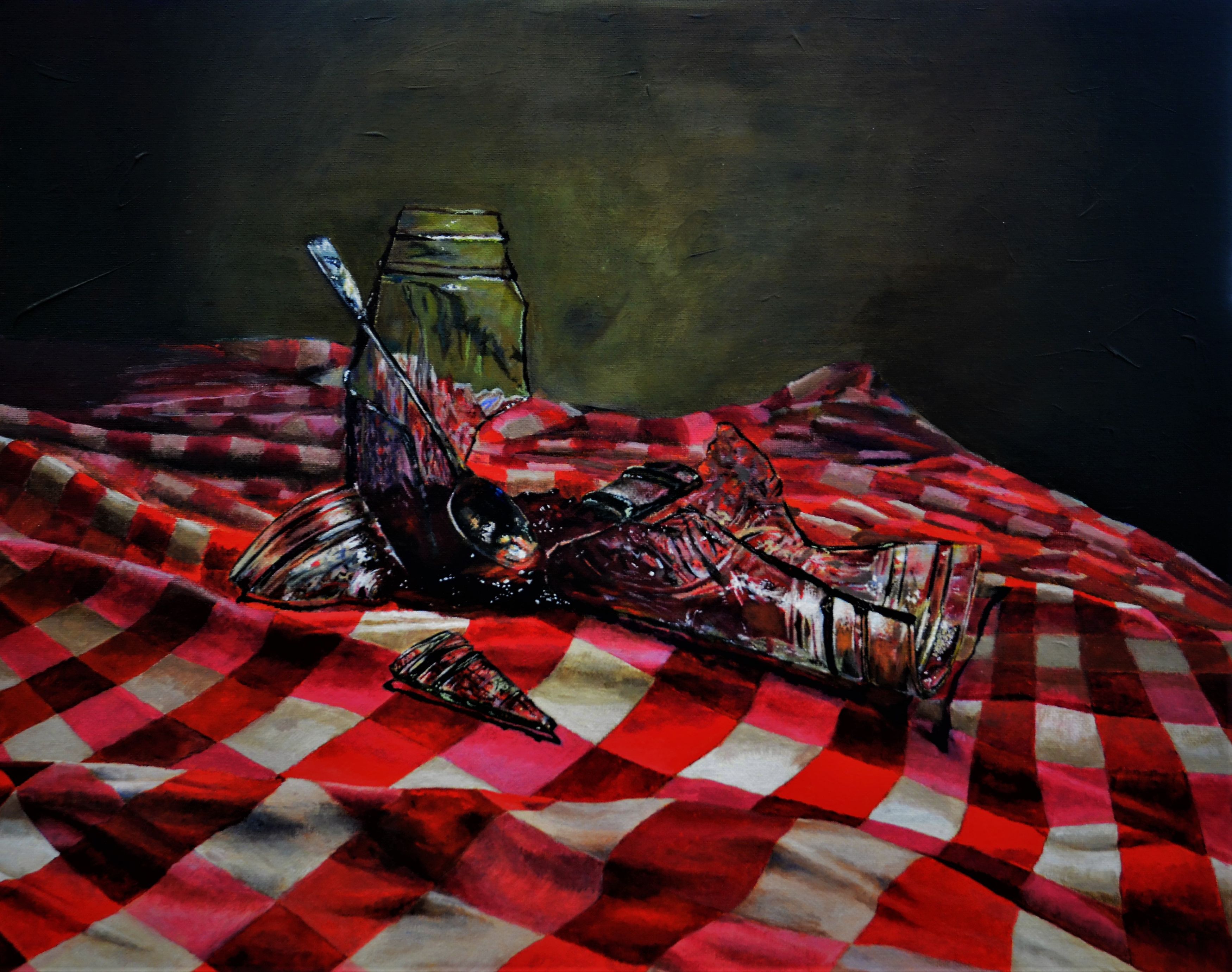
Nathan Kawecki (11th grade), Uh-oh, 2nd prize in painting 2022, 16″ x 20″, acrylic on canvas
Artist statement: Acrylic paint has grown to become one of my favorite mediums over the past couple of years. In this painting, I focused mainly on mood, composition, and realism. One artist that has always inspired me is Dutch Golden Age painter, Pieter Claesz. His attention to detail drove me to focus on the refractions and reflections in the glass. I was also inspired by the composition of his still lifes, and the dark mood they conveyed. The composition leaves the reader to interpret the story of the painting and inspire the imagination. I hope my painting does the same for its viewers.
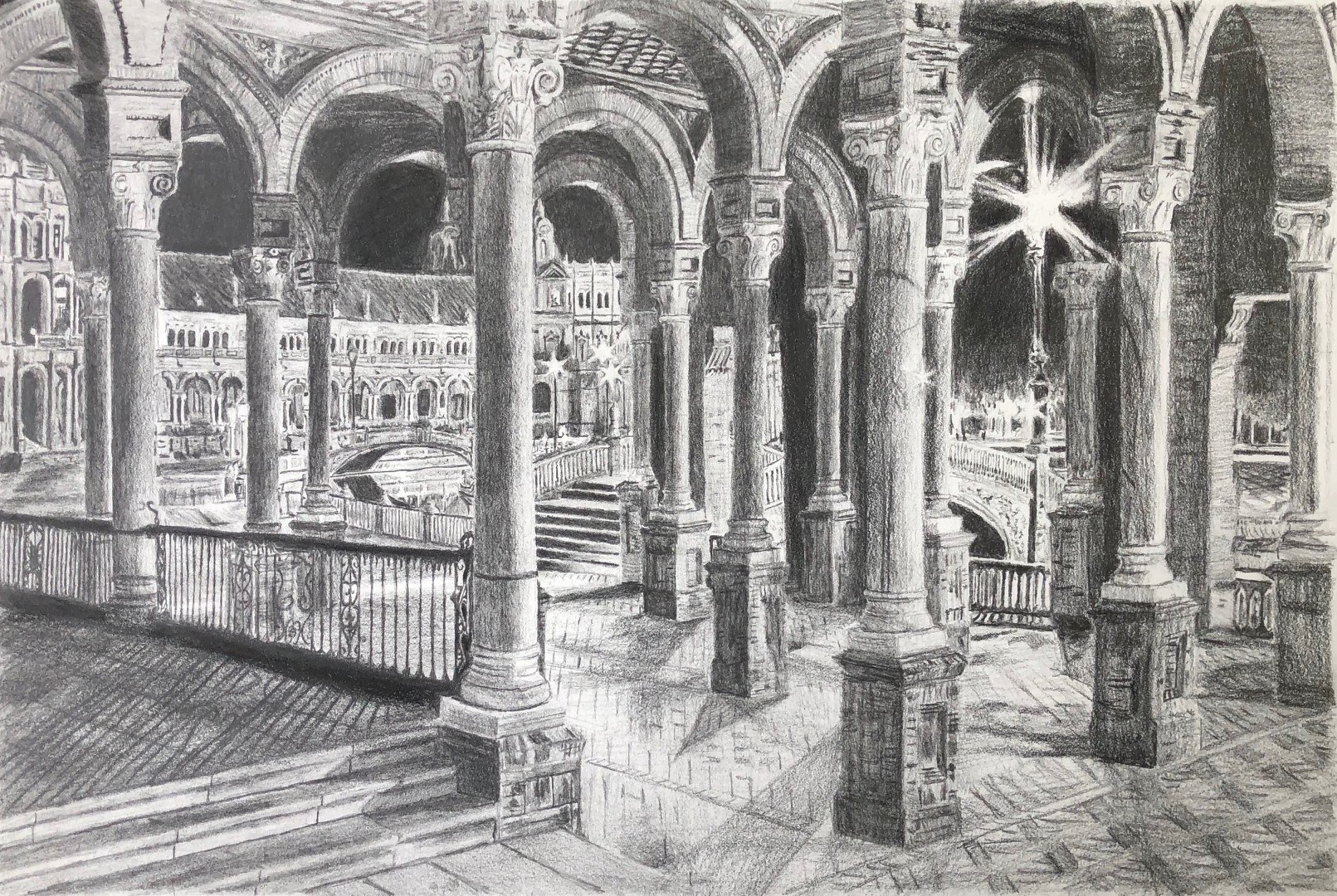 Gabriel Crane (9th grade), Colonnade, 1st prize in drawing 2020, 10" X 15", graphite on paper
Artist statement: I have always loved the medium of graphite and seeing how far I can stretch its realism. Graphite has always been my favorite medium for anything I try to replicate, and I love the contrast it can express in any scenario. This drawing was after a photograph taken in Italy, displaying the beauty and contrast of the columns and lights. Paul Cadden is an artist I admire for his great attention to detail. This brings each of his drawings together into a masterpiece. His lights and darks contrast incredibly well, making an ordinary scene look stunning. These are all aspects of drawing that I try to incorporate into my drawings and try to grow and improve in.
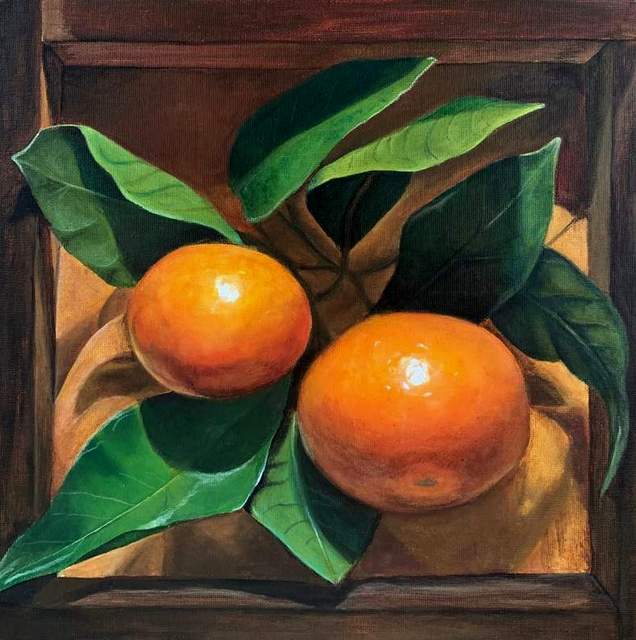 Seraphina Culp (12th grade), Sweetness, 1st prize in painting 2019, 12″ x 12″, acrylic on canvas
Artist statement: Earlier this year, I fell in love with trompe l’oeil. Trompe l’oeil is a style where objects of the composition appear to leave the canvas. In Sweetness, I was inspired to paint the “frame” directly on the canvas in the form of a box containing the oranges. Surprisingly, most orange varieties are ripe for picking in the winter months. I was amazed by how such freshness could be found in the bleakest time of year. It may be a reminder from God that there is goodness wherever you are, you just have to look for it.
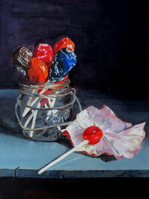 Jeremy Crawford (11th grade student), Unwrapped, 2nd prize in painting 2017, 16″ x 20″, acrylic on canvas
Artist statement: In painting class, we were instructed to paint a still life through the lens of contemporary realism. I was immediately drawn to the color and joy presented by these Tootsie Pops. I loved the reflection the lollipops had on the jar and the bright but unique color each lollipop gave off. When I was painting, I couldn’t help but notice how happy the painting was—it gave off such innocent joy and there was a bit of an inherent sense of story in the unwrapped yet unfinished candy sitting by itself. I have been greatly influenced by the contemporary still lifes of Michael Naples, as well as by the work of 18th c. French painter, Jean-Baptiste-Siméon Chardin. I love how they each use light to navigate the observer through their paintings. Moreover, both have a clever and ingenious way of producing life and a story through ordinary objects. In the same way, I strive to make my artwork more than just paint on a canvas, but a story worth telling, so that, even by means of a favorite childhood candy, my observer might feel moved, intrigued, and delighted.
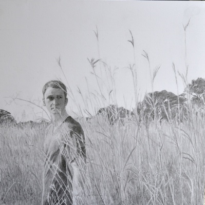 Drew Griffith (12th grade), Afield, 1st prize in drawing 2015, graphite on paper
Artist statement: My drawing represents a desire in my work to portray realism and accuracy like that of modern artists such as JD Hilberry, whose amazing graphite works I wanted to emulate. Our art teacher showed me how such contemporary work was rooted in the artists of the Realism movement of the 19th century, who sought to depict their subjects with an unvarnished truth and clarity. Later artists, such as 20th century realist Edward Hopper, continued in this tradition while emphasizing strongly defined lighting and mood. Hopper’s work often has a sense of eerie stillness, a mood which I also tried to create by framing the lonely figure in the composition and by using strong value contrasts. In previous projects, imitations of pointillist technique modeled after Georges Seurat disciplined me to observe how carefully planned moves of shade and shadow can bring even greater realism to my work, regardless of the medium.
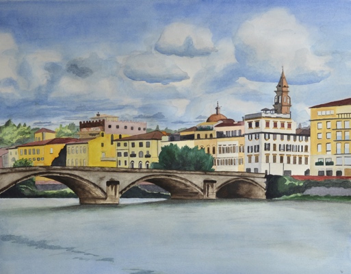 Jay Wallen (12th grade), Ponte Santa Trinita, Florence, 2nd prize in painting 2015, watercolor on paper
Artist statement: After an amazing trip to Europe, I wanted to capture something of the mood and feel of some of my adventures, in the manner of the great American watercolor artist John Singer Sargent. I admire the way he used color and clarity to indicate the focal point of his pictures, although his style is much looser than my own. I used a more exact style of watercolor painting to communicate the beautiful structural detail of the buildings and the bridge while retaining a certain smooth and transparent feel overall. However, like Sargent, who painted beautiful scenes during his own European travels, I also wanted to capture something of the warmth and color of the light on the buildings of Florence, using a variety of my own photographs for reference.
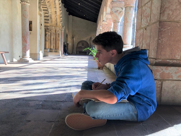
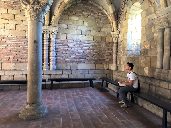
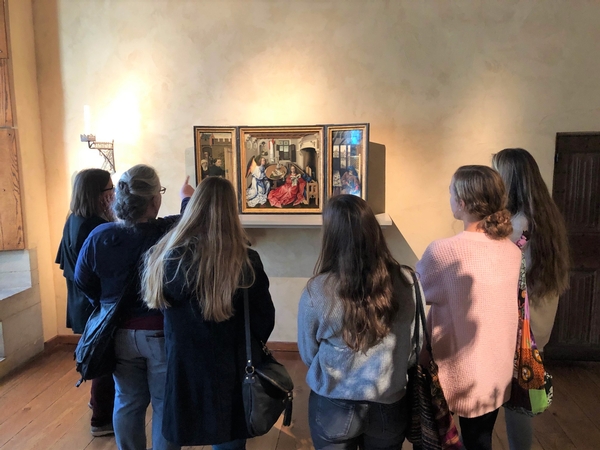
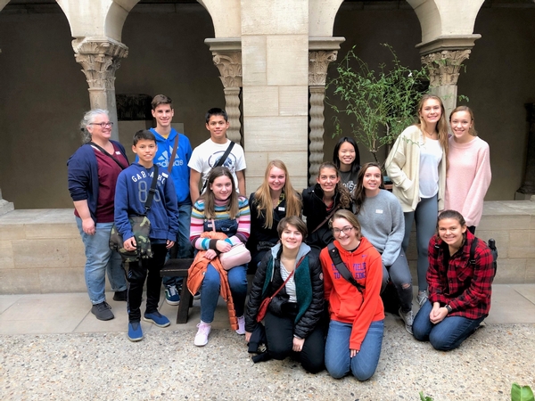
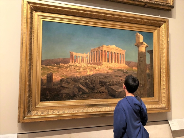
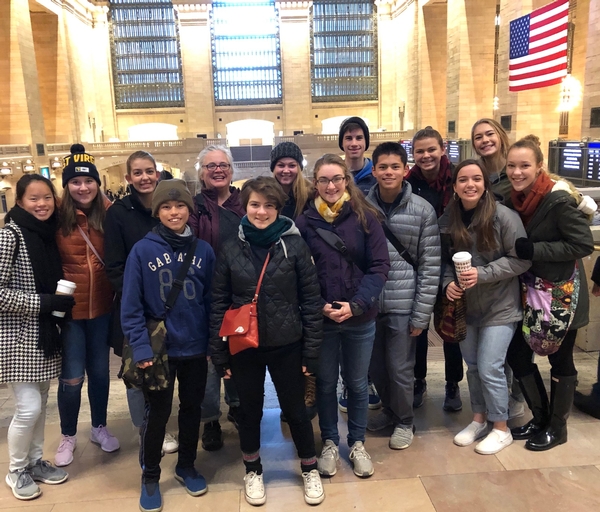
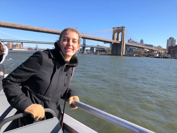
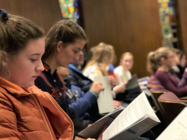
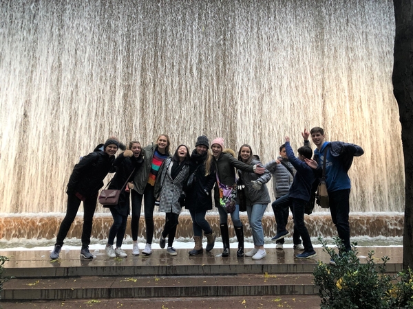
Mrs. Stevens, upper school art and humanities instructor, took 13 painting students and a handful of parents to New York City to take in the various forms of art throughout the city. It was 3 full days of touring the city, the museums (The Met and The Cloisters), the 911 Memorial, the New York Public Library, Central Park, Times Square, the financial district, and various cathedrals. We saw the Brooklyn Bridge by ferry, walked over 20 miles throughout Manhattan, conquered the subway system (or at least we didn't lose anyone!), and attended service together at Redeemer East Side.
All the while, Mrs. Stevens, challenged the students to think about what they saw:
- Why was this art created?
- Who was it for?
- How important is the language of symbols?
- Who chooses what a culture values and preserves?
- How does curation impact our experience of art?
- What repeated themes are seen in art?
- What are the purposes of public art?
- How is our creative capactiy evidenced in our worship?
- What is the responsibility of the Christian artist in the Church and the world?
